


 LinkBack URL
 About LinkBacks


 Reply With Quote
|
|
Results 176 to 200 of 225
Thread: New banner development
-
09-16-2007 08:36 PM #176Member

- Join Date
- Jan 2007
- Gender

- Posts
- 2,893
- Likes
- 2
No offence sugarglider but i really don't like the one you made. I think the text is too far to the right, it looks better centered but even the one you centered was a bit too basic, i also think that there is too much going on, too many things on the banner itself.
CloudWalker, i like your flash design, however i think the twinkling stars would work well on the one we have now, i just don't think that your design would work unless we got a new skin aswell. But i do like the stars twinkling.
Just my thoughts...
-
09-16-2007 09:44 PM #177You merely have to change your point of view slightly, and then that glass will sparkle when it reflects the light.
-
09-16-2007 09:49 PM #178Member
- Join Date
- Jan 2007
- Gender
- Posts
- 2,893
- Likes
- 2
I like that, looks nice, good job

-
09-16-2007 10:59 PM #179Toast
- Join Date
- Sep 2006
- Gender
- Location
- Undisclosed :O
- Posts
- 1,083
- Likes
- 4
I have to say that I really don't like the flashing starts. They just look too tacky and overly spiritual... almost [brace yourself] ld4all style. Well, I wouldn't quite go that far, but you get my drift. Originally Posted by cloudWalker

If we're going to have a new banner, might as well have a completely new one. Otherwise just stick with this one. I think it's fine.
-
09-16-2007 11:29 PM #180Boom! Achievements:


- Join Date
- Oct 2006
- Gender
- Location
- under your bed haha Posts: -134
- Posts
- 1,012
- Likes
- 2
the stars on a day banner dont look good and the stars look to fake.
here is another version of mine

-
09-16-2007 11:57 PM #181
cloudWalker screams and stamps his feet.
eat my foot.
i dunno what im doing most of the time, i just want to do something, im awesome with swish and i need a project.
yes, i agree the stars look tacky.
give me a proper project. pleeeaseee someone.
i can do strange things thought umposibiblarle.You merely have to change your point of view slightly, and then that glass will sparkle when it reflects the light.
-
09-17-2007 04:07 AM #182섹시한 암컷

- Join Date
- Aug 2007
- LD Count
- Natural.
- Gender
- Location
- Wyoming
- Posts
- 991
- Likes
- 69
I like the stars effect on your first one, cloudwalker, it looked nice. And also i like the one sugerglider made, but its too full of stuff. If you took out the sleeping dude to the right and the little fuzzy man in the middle, it would look really cool in my opinion.
SIG MADE BY KROMOH
****[Mario92] 2:59 am: I just dedicated my last bowel movement to Christ. Invoke that.
-
09-17-2007 05:14 PM #183Member

- Join Date
- Aug 2007
- Gender
- Location
- Eugene OR
- Posts
- 398
- Likes
- 0
I can do forum design. I am no coder but I have done some art direction with coders to make customized designs that work a lot better than this default blue style.
This site isn't vBulletin, it's some cheaper more simple code but I think with a little design it made it look a lot better. And just ignore the content and look at the design.
http://www.unworthyunwritten.com
I did 100% of the design with this site.
-
09-17-2007 09:02 PM #184Master of Logic Achievements:


- Join Date
- Feb 2007
- Gender
- Location
- Some rocky planet with water
- Posts
- 3,993
- Likes
- 90
The sleeping dude could be taken off, but the little fuzzy man is a must. It just locates you inside that limitless dream. I like the centred text version, though Originally Posted by C911
I'd love t osee a sketch of what you could improve about Dreamviews Originally Posted by jaasum


Saying quantum physics explains cognitive processes is just like saying geology explains jurisprudence.
-
09-17-2007 09:08 PM #185Member
- Join Date
- Aug 2007
- Gender
- Location
- Eugene OR
- Posts
- 398
- Likes
- 0
Who is the person that would ultimately decide on a new design? Because I like this community, I found it the most helpful with my lucid dreaming and I think an enhanced design would greatly help, so I would be interested in professionally revamping the entire thing if the owners were interested.
I would start with concept before I even sketched something.
-
09-17-2007 09:18 PM #186Boom! Achievements:
- Join Date
- Oct 2006
- Gender
- Location
- under your bed haha Posts: -134
- Posts
- 1,012
- Likes
- 2
no sleeping guy and I moved the text over with the guy in a different place

-
09-18-2007 12:54 AM #187Master of Logic Achievements:
- Join Date
- Feb 2007
- Gender
- Location
- Some rocky planet with water
- Posts
- 3,993
- Likes
- 90
I believe that an yof the adins would do, but you'd probably want to talk to Seeker. He's the oldest admin around here, he'll know what to do. Originally Posted by jaasum
Not that long ago there was this design contest which nobody showed interest in. I'm sure a new design would be highly welcome.
And about the concept, mind personal suggestion? I really like the blue set of colours we have now. What reallys disgusts me in this design is the tacky look. So, if you could keep the colour system, or maybe make details darker, it would suit perfectly. But that is just my idea
Originally Posted by sugarglider11
Looks really good makes me feel like dreamign just to visit that landscape.
Saying quantum physics explains cognitive processes is just like saying geology explains jurisprudence.
-
09-18-2007 01:04 AM #188Boom! Achievements:
- Join Date
- Oct 2006
- Gender
- Location
- under your bed haha Posts: -134
- Posts
- 1,012
- Likes
- 2
it does look better without the wierd guy, thanks for telling me to get rid of him, and thanks for liking it kromoh.
Last edited by Sugarglider11; 09-18-2007 at 02:17 AM.
-
09-19-2007 07:13 AM #189WILD student

- Join Date
- Feb 2007
- Gender
- Location
- Near to New York
- Posts
- 2,058
- Likes
- 93
Oh boy, there really are so many great ones to choose from...many people here seem to have alot of talent with imagery and art...keep it up, I enjoy looking at the possibilities.
Brothers & Sisters in Dreams
-
09-19-2007 09:11 PM #190Boom! Achievements:
- Join Date
- Oct 2006
- Gender
- Location
- under your bed haha Posts: -134
- Posts
- 1,012
- Likes
- 2
thanks, do you like mine?
-
09-20-2007 12:40 AM #191Member Achievements:


- Join Date
- Oct 2003
- Gender

- Posts
- 4,668
- Likes
- 21
It's way too "linear" for me. The fact that the mountains are so far away makes it all look like a line... just like the banner is broken into two parts. Doesn't look good to me.
-
09-20-2007 01:46 AM #192Master of Logic Achievements:
- Join Date
- Feb 2007
- Gender
- Location
- Some rocky planet with water
- Posts
- 3,993
- Likes
- 90
I couldn't disagree more. There is no way to represent a decent landscape without making the horizon flat. If the horizon isn't flat, then the view is not coming from above. Originally Posted by wasup
By the way sugarglider, the little man in there is just awesome, I keep telling myself. Gives me such a sense of freedom
Saying quantum physics explains cognitive processes is just like saying geology explains jurisprudence.
-
09-20-2007 01:50 AM #193Boom! Achievements:
- Join Date
- Oct 2006
- Gender
- Location
- under your bed haha Posts: -134
- Posts
- 1,012
- Likes
- 2
kromoh, do you have any way I could make it better
-
09-20-2007 06:21 AM #194The Illuminated One

- Join Date
- Jul 2007
- Gender
- Location
- Pyramid.............. Job: Webmaster
- Posts
- 433
- Likes
- 3
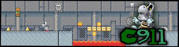
played with photoshop heres what i got :

Proud Owner & Co-creator of GamerzTrust.com & Gotmovies.net
-
09-22-2007 03:40 AM #195Boom! Achievements:
- Join Date
- Oct 2006
- Gender
- Location
- under your bed haha Posts: -134
- Posts
- 1,012
- Likes
- 2
I would look realy cool if you got rid of the wierd snowflake
-
09-22-2007 07:04 AM #196^_^

- Join Date
- Jul 2005
- Gender
- Location
- Northern Ontario
- Posts
- 207
- Likes
- 0
How about a theme banner for a month ie. Holloween?
Good timing for a start since DV participation is slow.....sometimes
no?
-
09-22-2007 10:05 AM #197Member
- Join Date
- Jan 2007
- Gender
- Posts
- 2,893
- Likes
- 2
No offence born_2_kill but i don't like the whole reflection and mirroring of the images across the banner.
-
09-23-2007 05:32 AM #198The Inceptor Achievements:


- Join Date
- Aug 2006
- LD Count
- 4
- Gender
- Location
- Canada
- Posts
- 316
- Likes
- 0

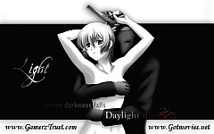
First banner for the site from me, so be nice.An Idea. A single idea from the human mind can build cities. An idea can transform the world and rewrite all the rules.
DEILD: 3
DILD: 1
-
09-23-2007 05:59 AM #199Boom! Achievements:
- Join Date
- Oct 2006
- Gender
- Location
- under your bed haha Posts: -134
- Posts
- 1,012
- Likes
- 2
I think its too small and dark, it needs more color
-
09-23-2007 10:46 AM #200Member

- Join Date
- Sep 2006
- Gender
- Location
- In a pot.
- Posts
- 2,706
- Likes
- 60
Yes, perhaps it does. But in my opinion, he captured the DV "feel" if you know what I mean.


 Posting Permissions
- You may not post new threads
- You may not post replies
- You may not post attachments
- You may not edit your posts
Bookmarks