


 LinkBack URL
 About LinkBacks


 Reply With Quote
I think they're actually pretty good, however, your text often doesn't fit in with the picture very well, like it's an afterthought. |
|
Results 1 to 8 of 8
Thread: Some new signatures
-
03-01-2009 06:54 PM #1Member Achievements:


- Join Date
- Aug 2008
- Gender

- Location
- Florida
- Posts
- 93
- Likes
- 1
Some new signatures
These are some signatures for various people on various forums that I have made for people. Please criticize, I can take it.


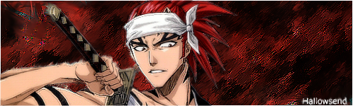

Again, feel free to criticize me. The 2 at the beginning are newest, and the last is my favorite. All with the name "Hallowsend" I made for myself, so perhaps I'm not impartial to giving everyone sigs of the same quality as my own
-
03-01-2009 09:41 PM #2Callapygian Superstar

- Join Date
- Jan 2007
- Gender
- Location
- Budapest
- Posts
- 1,901
- Likes
- 11
Last edited by Goldney; 03-01-2009 at 09:45 PM.
*............*............*
-
03-01-2009 10:37 PM #3"O" will suffice. Achievements:


- Join Date
- Apr 2005
- LD Count
- 20+ Years Worth
- Gender
- Location
- Central Florida
- Posts
- 16,083
- Likes
- 4032
- DJ Entries
- 149
The third one is awesome. That text takes a lot away from it, though.
 Dream Journal: Dreamwalker Chronicles Latest Entry: 01/02/2016 - "Hallway to Haven" (Lucid)(Or see the very best of my journal entries @ dreamwalkerchronicles.blogspot)
-
03-02-2009 12:12 AM #4FightingDreamer Achievements:


- Join Date
- Oct 2008
- Gender
- Location
- Here
- Posts
- 757
- Likes
- 3
Wow, all of those are really good.
My favorites are the third, fourth, and fifth.
Though I think the fifth should be wider, and I agree with Oneironaut about the text on the third.
-
03-02-2009 12:30 AM #5Member Achievements:
- Join Date
- Aug 2008
- Gender
- Location
- Florida
- Posts
- 93
- Likes
- 1
Thanks for the comments, and of all my weaknesses text and depth are my worst. Im going to by some typography books to improve that, and possibly consult from my friend who is a professional in this field.
-
03-02-2009 07:17 PM #6Member

- Join Date
- Feb 2009
- Posts
- 57
- Likes
- 0
hey hi. I also like to make signatures. A little comment. Try not to satisfy yourself just just making a background and adding it just a single and plane effect. Interfere it the most you can. Mix it, blur it, twist it, change its angle, etc, etc. Thats the recommendation I would make. And one thing more. Improve the fonts. They are very plane and boring, try to add colors that combine and add them shadows and stuff you like.
 total LD: 1!!!!
-
03-07-2009 03:40 PM #7Callapygian Superstar
- Join Date
- Jan 2007
- Gender
- Location
- Budapest
- Posts
- 1,901
- Likes
- 11
Just practice and experiment. A book can only teach you so much. Originally Posted by Geeome
 *............*............*
-
03-07-2009 04:53 PM #8
It's always about the composition, the form.
What looks best is the last one, even if less work went into it.
Text you might want to work on with placement.
If it's a sig you're creating for yourself, then there's no problems with having to conform to other people's placement requests. In centre-left or centre-right is often the best, if you decide to put in text at all.
Try not to blend the picture into the effects, have the effects work for the picture, have them be a part of it. I also think there's too much negative space in most of them.
Third one is second best, I suggest creating a fire-bright-lighting sort of effect if you want to spice it up.
-
It's three AM. Lucid time.
 Posting Permissions
- You may not post new threads
- You may not post replies
- You may not post attachments
- You may not edit your posts
Bookmarks