


 LinkBack URL
 About LinkBacks


 Reply With Quote
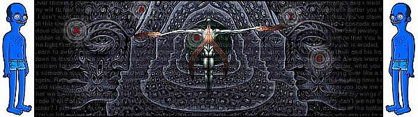
that first parrot one is by far the best. great coloring. personally I'm not too big on anime, but there's not a whole lot going on in the second to last one. The last one is pretty too, though. Although I want to say that i'd like to see some more texture, or something to make the tiger 'pop' more. |
|
Results 1 to 6 of 6
Thread: signatures
-
03-20-2009 03:46 AM #1Member


- Join Date
- Mar 2009
- Posts
- 26
- Likes
- 0
signatures
most recent work.


-
03-20-2009 07:13 PM #2Astral Warrior Achievements:


- Join Date
- Jan 2009
- LD Count
- a butt-load
- Gender

- Location
- California
- Posts
- 237
- Likes
- 35
- DJ Entries
- 26
I am the DREAMJUMPER
-
03-20-2009 08:38 PM #3Member
- Join Date
- Mar 2009
- Posts
- 26
- Likes
- 0
thanks for the feedback! Originally Posted by Captain Frapo

-
03-21-2009 06:15 AM #4
I like them, good composition, simple, no overdone effects.
Just one thing I'd suggest- that you make sure they don't end up too sharp, there's a few things that stick out and stuff, which don't help greatly with the blending.
The 2nd and the 3rd I like best. The second has great perspective, and the third has good complimenting colours, with the focal render blending well. The flowers on the third are a bit rough, and could use a little 1px soft eraser brushing around the edges.
Last I also like for the pasty painted look, I'd personally have blurred the grass slightly and even more slightly sharpened the centre of the face and trailing down to the midsection.
You have a keen eye for what looks good, and very nice use of repeating renders. You merely have to change your point of view slightly, and then that glass will sparkle when it reflects the light.
-
03-22-2009 03:01 AM #5Member
- Join Date
- Mar 2009
- Posts
- 26
- Likes
- 0
Thank you, that's what i call a good comment haha. Originally Posted by ClouD
-
04-16-2009 09:54 PM #6New to LD,need experience

- Join Date
- Apr 2009
- Gender
- Location
- Supercalifragilisticexpiali Posts: 99,892 Just Kidding!!!
- Posts
- 24
- Likes
- 0
Wow, i like the first and last one, they're* good.
Goals: [x] Have a Lucid Dream [ ] Stay in an LD for longer than 20 seconds [ ] Explore Details in a LD [ ] Find my crush [x] You know what [ ] Fly [ ] Punch the teacher that gave me a 40 on a test
LD Count: 2
Current Task: Be able to have a LD at will, or at least more often.
My website: http://www.stephensmith.co.cc/

 Posting Permissions
- You may not post new threads
- You may not post replies
- You may not post attachments
- You may not edit your posts
Bookmarks