


 LinkBack URL
 About LinkBacks

 Reply With Quote
I like it! |
|
Results 151 to 175 of 380
Thread: Rate signatures
-
09-09-2007 03:24 PM #151Member

- Join Date
- Apr 2006
- Gender

- Posts
- 5,964
- Likes
- 230
No amount of praise is sufficient; except it does have that effect on me where I look at it for too long, so 9.5/10
Oh yea thanks MOS, that's a good idea. That's exactly what I need to do. Originally Posted by Man of Steel

PS OK, I did it, that looks better, thanks. I can't get rid of that space. Oh well I'll try again later.Last edited by Moonbeam; 09-09-2007 at 04:27 PM.
-
09-09-2007 06:55 PM #152"O" will suffice. Achievements:


- Join Date
- Apr 2005
- LD Count
- 20+ Years Worth
- Gender

- Location
- Central Florida
- Posts
- 16,083
- Likes
- 4032
- DJ Entries
- 149
 Dream Journal: Dreamwalker Chronicles Latest Entry: 01/02/2016 - "Hallway to Haven" (Lucid)(Or see the very best of my journal entries @ dreamwalkerchronicles.blogspot)
-
09-09-2007 06:57 PM #153Wanderer

- Join Date
- Sep 2005
- Gender
- Location
- On a journey
- Posts
- 2,039
- Likes
- 4
648 x 216 is...too much. Perhaps not horizontally but vertically for sure, especially since there's text too. >.<
Otherwise, a fun signature. I still can't grasp the meaning of "I know lucidity", heh.
Oh, aye, the rating: 6/10, I guess. I'm not good at rating!
-
09-09-2007 07:28 PM #154"O" will suffice. Achievements:
- Join Date
- Apr 2005
- LD Count
- 20+ Years Worth
- Gender
- Location
- Central Florida
- Posts
- 16,083
- Likes
- 4032
- DJ Entries
- 149
Yeah, I had a little issue with the size as well, which I brought up in another thread. I felt that making it any smaller would make it hard to see the details (like the facial features of the characters), but it did bother me, so I took it down a notch, just now.

Also, the "I know Lucidity" thing was more fitting when I had my Matrix-y sig up, a while ago. It was a play on Neo's "I know Kung-Fu" line, from the movie. But, now that you mention it, it was a bit out of place, after the changing of my sig, so I scratched that, too.
And I like your sig, Merlock. Very clean. What made you choose the two characters in it? I also like the way the mist makes the "Merlock" text seem to shine. Very well done. 10/10 Dream Journal: Dreamwalker Chronicles Latest Entry: 01/02/2016 - "Hallway to Haven" (Lucid)(Or see the very best of my journal entries @ dreamwalkerchronicles.blogspot)
-
09-09-2007 07:42 PM #155Wanderer
- Join Date
- Sep 2005
- Gender
- Location
- On a journey
- Posts
- 2,039
- Likes
- 4
You don't need to resize the full signature to make it smaller vertically. Generally, in such cases, it's typical to cut off the bottom or top (or a bit of both). That way the aspect ratio, the detail and all such remain but the banner sig becomes more "slender" and of a fitting size. Especially since the faces in that signature seem to be the main focus (like the ninja's face), so cutting the bottom off somewhat would only send focus on the faces and make the signature even more "slik", as it were.
As for my signature, I chose Ukitake because he has a deep thoughtful gaze on his face much of the time. The kind I've found myself to have often nowadays. And has a great personality and inner qualities.
-
09-09-2007 07:53 PM #156"O" will suffice. Achievements:
- Join Date
- Apr 2005
- LD Count
- 20+ Years Worth
- Gender
- Location
- Central Florida
- Posts
- 16,083
- Likes
- 4032
- DJ Entries
- 149
That's actually what I did, but I cut off some of the top, instead of the bottom. I feel kinda hard-pressed to cut off the bottom, because I like being able to see the hand of the "Me" on the right, in the reflection of the mirror, as well as the sword hilt, behind the back of the ninja, and just a hint of the chain weapon that is flailing around the ninja's body. So I clipped off some of the excess on top, and still compressed it about 10%, vertically. Originally Posted by Merlock
Dream Journal: Dreamwalker Chronicles Latest Entry: 01/02/2016 - "Hallway to Haven" (Lucid)(Or see the very best of my journal entries @ dreamwalkerchronicles.blogspot)
-
09-09-2007 08:00 PM #157Toast
- Join Date
- Sep 2006
- Gender
- Location
- Undisclosed :O
- Posts
- 1,083
- Likes
- 4
nice, like the first and second pictures, although I don't like the one on the right ("me"?). It looks too computer generated, like a game.
The writing also works
9/10
-
09-09-2007 08:07 PM #158Member
- Join Date
- Jan 2007
- Gender
- Posts
- 2,893
- Likes
- 2
Simple, but great, maybe a different font in my opinion but overall a simplistic but effective signature

9/10
-
09-09-2007 08:11 PM #159!DIREKTOR!

- Join Date
- Jan 2007
- Gender
- Location
- Aquanina's closet
- Posts
- 5,195
- Likes
- 34
you need to soft enter. Rather than pushing enter, press shirt and enter Originally Posted by Moonbeam
Lucid Seeker 9/10 I look like a playing card, very original too
-
09-09-2007 08:17 PM #160Member
- Join Date
- Apr 2006
- Gender
- Posts
- 5,964
- Likes
- 230
Interesting; it looks like you actually made something out of fabric and stuff and then took a pic of it. 9/10.
Thanks, but I'm having trouble finding the "shirt" key. Originally Posted by Adam
 Thanks I'll go try that.
PS Yay I did it. That was hard. Thanks guys. (O I don't know if i can make the pic bigger but I'll try.)Last edited by Moonbeam; 09-09-2007 at 08:23 PM.
-
09-09-2007 09:48 PM #161Member Achievements:


- Join Date
- May 2007
- Gender
- Location
- New Hampshire
- Posts
- 1,130
- Likes
- 45
- DJ Entries
- 6
10/10 for MB... If I don't feel like looking up the new tasks for each month, all I have to do is look at her siggy!


-
09-09-2007 10:58 PM #162!DIREKTOR!
- Join Date
- Jan 2007
- Gender
- Location
- Aquanina's closet
- Posts
- 5,195
- Likes
- 34
hehe you knew I meant shiFt key Originally Posted by Moonbeam
Meggy I love the Lion 10/10
-
09-09-2007 11:00 PM #163
6/10 . reminds me for some reason of basketball.. and i dont like basketball..
-
09-09-2007 11:06 PM #164Old Seahag

- Join Date
- Dec 2004
- Gender
- Posts
- 2,374
- Likes
- 7
4/10the colours clash with the avatar and the size seems all wrong.
-
09-09-2007 11:09 PM #165
7/10 b/c shes so pretty.
(Theres a thread dedicated to changing my sig, I had no idea existed until earlier today, so apparently, my sig shall be changed in the future, near or far)
-
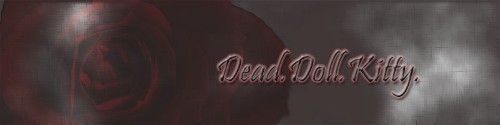
09-09-2007 11:30 PM #166Gentlemen. Ladies.

- Join Date
- Mar 2007
- Gender

- Location
- Right here... Reputation: 9999
- Posts
- 4,902
- Likes
- 473
- DJ Entries
- 4
10/10 I really like the mood of it...
Reminds me of some kind of food or something...
-
09-09-2007 11:35 PM #167-

- Join Date
- Dec 2005
- Gender
- Location
- The Netherlands
- Posts
- 4,438
- Likes
- 7
Not a big fan of anime, especially if their faces are 50% pink. Originally Posted by slayer
5/10What a peculiar privilege has this little agitation of the brain which we call 'thought' -Hume
-
09-10-2007 12:07 AM #168Banned
- Join Date
- Aug 2007
- Gender
- Location
- The ocean of fear
- Posts
- 393
- Likes
- 0
ok this is my newest signature... i've spended most time on it than any other of my signatures... (i think so) anyways. it has some special effets around the moon. (ive made it look like a "movie") aaandd...it's kinda "dark". what u ppl think?
-
09-10-2007 01:05 AM #169Gentlemen. Ladies.
- Join Date
- Mar 2007
- Gender
- Location
- Right here... Reputation: 9999
- Posts
- 4,902
- Likes
- 473
- DJ Entries
- 4
10/10
Awesome is all I have to say
-
09-10-2007 01:20 AM #170Banned
- Join Date
- Aug 2007
- Gender
- Location
- The ocean of fear
- Posts
- 393
- Likes
- 0
lol...tnx i'm glad u like it...cuz i like it too!
-
09-10-2007 05:02 AM #171Veteran of the DV Wars

- Join Date
- Mar 2007
- LD Count
- ~35
- Gender
- Location
- Houston, TX
- Posts
- 4,553
- Likes
- 94
Yep, 10/10 in my opinion as well, DreamWave. That one turned out great!
Moonbeam, glad I could help you there. It looks much better now, by the by.

-
09-10-2007 05:40 AM #172* DV Veteran * Achievements:


- Join Date
- Feb 2005
- Gender
- Location
- USA
- Posts
- 8,811
- Likes
- 98
I absolutely love your sig MoS.. definately 10/10.
-
09-10-2007 07:28 AM #173Banned
- Join Date
- Aug 2005
- Gender
- Posts
- 1,331
- Likes
- 7
You are Clairity I mean just look at that sig it's freaking awesome 100/10
-
09-10-2007 07:30 AM #174Veteran of the DV Wars
- Join Date
- Mar 2007
- LD Count
- ~35
- Gender
- Location
- Houston, TX
- Posts
- 4,553
- Likes
- 94
I really like that sig, Brandon. 10/10, mos' def'.
-
09-10-2007 07:31 AM #175Banned
- Join Date
- Aug 2005
- Gender
- Posts
- 1,331
- Likes
- 7
Fo' shizzle 10/10 MoS fo' sho'


 Posting Permissions
- You may not post new threads
- You may not post replies
- You may not post attachments
- You may not edit your posts
Bookmarks