


 LinkBack URL
 About LinkBacks


 Reply With Quote
I'm in love with the night one, but the day one just seems too green for my liking. Not to say it's bad, I just feel that it would clash with the forum skin. |
|
Results 76 to 100 of 225
Thread: New banner development
-
02-17-2006 04:06 AM #76Rotaredom


- Join Date
- Dec 2003
- Gender

- Location
- Undisclosed location
- Posts
- 10,272
- Likes
- 26
SHIT those are cool Joe.
Although the second one has a more nighttime theme, there is something special about the first one.
I can't put my finger on it. (other than the fact is is just good of coarse)
Excellent
-
02-17-2006 03:20 PM #77Old Seahag

- Join Date
- Dec 2004
- Gender
- Posts
- 2,374
- Likes
- 7
-
02-17-2006 03:22 PM #78Dreamer

- Join Date
- Jun 2004
- Gender
- Location
- Boston, Massachusetts, United States
- Posts
- 2,737
- Likes
- 8
the nightime onw is fricken awsome. We need that up right nowwwwww. I think the clouds should move a tad slower though. And i too think there is something too green about the day time one. maby it could have more of a cloud-y theme?
Need Help? Have Questions? PM me so I can help you out
"Dreams are as portals. Flat visions of misty places. But I can write dreams!" - Myst Uru
-
02-17-2006 05:55 PM #79Senior Pendejo

- Join Date
- Jan 2005
- Gender
- Location
- Rock n Roll Capital
- Posts
- 2,658
- Likes
- 26
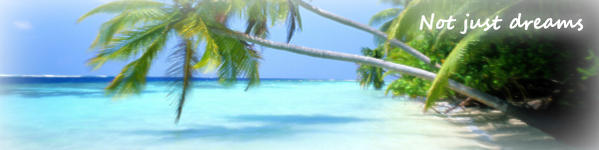
Ah, good point - I wasn't considering that at the time. I took a screenshot and placed it in the skin (below). Not sure what to think now. I can adjust the colors a bit - but if I make it blue we'll lose that sense of "day" in it. Besides, the colors were intended to bring on a bit of that fantasy quality. We might lose that if I start bringing it down to monotone.Not to say it's bad, I just feel that it would clash with the forum skin.[/b]

(screenshot of day)
Yep, that thought crossed my mind as well - I just wasn't sure how much time the viewer would actually spend looking at the banner so I figured it would get their attention right away if it went a tad faster, then they'd forget about it and scroll it off the screen.I think the clouds should move a tad slower though[/b]

(screenshot of night)
-
02-17-2006 07:31 PM #80Rotaredom
- Join Date
- Dec 2003
- Gender
- Location
- Undisclosed location
- Posts
- 10,272
- Likes
- 26
IMO. The reason I like the day version are two reasons.
It clashes only if you want the entire theme to be what it is.
The day scene adds an element of enthusiasm. It is subtly fitting and far from intrusive to the theme.
Dreaming. Yes it happens at night. In the real world in its literal sense ( most of the time). But what really portrays a "dream scene" better? The day version has a much more majestic and dreamy feel to it. With a positive twist.
-
02-17-2006 08:05 PM #81Dreamer
- Join Date
- Jun 2004
- Gender
- Location
- Boston, Massachusetts, United States
- Posts
- 2,737
- Likes
- 8
Okay, so when can these go up?
 Need Help? Have Questions? PM me so I can help you out
"Dreams are as portals. Flat visions of misty places. But I can write dreams!" - Myst Uru
-
02-18-2006 01:36 AM #82Rotaredom
- Join Date
- Dec 2003
- Gender
- Location
- Undisclosed location
- Posts
- 10,272
- Likes
- 26
Day & night banner
Easy for me to say..BUT.
Just think how cool it would be if you could somehow have the day banner come up during the day and visa versa.
I know we all have different time zones so I don't know if it would even be possible...
But tell me that would not be cool
-
02-18-2006 02:04 AM #83Rotaredom
- Join Date
- Dec 2003
- Gender
- Location
- Undisclosed location
- Posts
- 10,272
- Likes
- 26
I am totally with you on that Joe.Originally posted by Tornadoe Joe
Ah, good point - I wasn't considering that at the time. I took a screenshot and placed it in the skin (below). Not sure what to think now. I can adjust the colors a bit - but if I make it blue we'll lose that sense of "day" in it. Besides, the colors were intended to bring on a bit of that fantasy quality. We might lose that if I start bringing it down to monotone.
IMO. The reason I like the day version are two reasons.
It clashes only if you want the entire theme to be what it is.
The day scene adds an element of enthusiasm. It is subtly fitting and far from intrusive to the theme.
Dreaming. Yes it happens at night. In the real world in its literal sense ( most of the time). But what really portrays a "dream scene" better? The day version has a much more majestic and dreamy feel to it. With a positive twist.
-
03-08-2006 12:56 AM #84Banned

- Join Date
- Aug 2005
- Posts
- 9,984
- Likes
- 3084
Note: I just got Flash 8, so now I can do those alpha clouds which icedawg wants so much.
I might be busy this fortnight, but I'm just letting you know that I might create something sooner or later.
Oh, people who have Flash 8: Is there any reason why you can't give symbols filters? You can only give them to an image if it's a button, but considering you could jut create a void button, what's the point? I have a feeling that I'm missing something. Thanks.
-
03-09-2006 01:44 AM #85The not-so-lucid guy Achievements:


- Join Date
- Dec 2005
- Gender
- Location
- Bed
- Posts
- 78
- Likes
- 6
You can also apply it to a movie clip, and it's just like a symbol but with a little more stuf, anyway I'm better with actionscript than with making pretty stuff so I'm not 100% sure, depending on what you want to do.Originally posted by Xei
Note: I just got Flash 8, so now I can do those alpha clouds which icedawg wants so much.
I might be busy this fortnight, but I'm just letting you know that I might create something sooner or later.
Oh, people who have Flash 8: Is there any reason why you can't give symbols filters? You can only give them to an image if it's a button, but considering you could jut create a void button, what's the point? I have a feeling that I'm missing something. Thanks.
CyaZzzzzZZzzz....
-
03-09-2006 03:57 AM #86"O" will suffice. Achievements:


- Join Date
- Apr 2005
- LD Count
- 20+ Years Worth
- Gender
- Location
- Central Florida
- Posts
- 16,083
- Likes
- 4032
- DJ Entries
- 149
First time I've seen this thread...
WOW, Joe. Good shit, man.
They are both perfect, if you ask me. I think they represent the bright, colorful, almost intrusive to dreaming (edit: that I just noticed Howetzer already mentioned), day transitioning into the, frankly awesome, night scene that meshes with the blue and gray of this forum, very nicely. Dream Journal: Dreamwalker Chronicles Latest Entry: 01/02/2016 - "Hallway to Haven" (Lucid)(Or see the very best of my journal entries @ dreamwalkerchronicles.blogspot)
-
04-04-2006 10:44 PM #87Member

- Join Date
- Jun 2003
- Gender
- Location
- right here
- Posts
- 2,822
- Likes
- 34
Hey MCB, Tornado, Xei, and anyone else who is interested in working on this project:
what I've seen so far looks great! I've got a bunch of ideas about how I'd like to customize things, but haven't all that much time to get into everything right now. To just mention a few, it suddenly occurred to me maybe we should have the 'Dream Views' title subtly rise and fall--just a tiny, tiny bit--behind the mountains on a continuous cycle. I also think we should have the title first present itself by rising completely from behind the mountains, instead of the text appearing from the left as it currently does. Also, as I've suggested, I think some more opaque, slower clouds could really work well. And I agree that the green and pink aren't working with the colour scheme. Oh...and I'd like to wrap the new headers with the flash ideas from MCB.
Anyway though, I was wondering if maybe we could all work on this beginning like around the end of April or sometime in May? I should have time then.
Thanks for all the great ideas thus far.Each new day is a chance to turn it all around.
-
04-05-2006 02:09 AM #88Member Achievements:


- Join Date
- Oct 2003
- Gender

- Posts
- 4,668
- Likes
- 21
They are great... but... (don't flame me for giving negative comments you dingbatters)
Well, the content... stuff below the banner... has a really "professional and sleek" look and your banner is more of a "friendly" and like... "loose" look to it... like it's not as uniform and all. That's not a bad thing that yours is like that, I'm just saying how it should match the rest of the forum. Like notice how in LD4all (haven't checked it for a while but I'm guessing it hasn't changed much) everything is so bright and happy... like that's throughout the whole forum. I think ice should modify another theme to match that banner. It's a good banner, but the banner we have now and this theme complement each other perfectly...
Also, loading time. Sure those with high connections get it to load fast... but it will take a very long time for it to load with crappier connections...
-
04-11-2006 12:07 AM #89Banned
- Join Date
- Aug 2005
- Posts
- 9,984
- Likes
- 3084
That was exactly what I thought.
Our current banners have all been very... well, I suppose 'cosy' is the word, and LD4All is what came to my mind, too. Dream Views tends to take a more sleek and professional look, so I think we should reflect this in our designs.
I'm thinking light blue glows, gradients, clear white text, that kind of thing. Mysterious, yet formally so.
I'll do some work on it. Oh, and MCB: Many thanks. Yeah, it turns out that they just didn't have time to program it for symbols. Up until when I read into it, I had always thought that movie clips were actual clips from a video recorder and whatnot.
-
05-08-2006 02:07 AM #90Member

- Join Date
- Sep 2005
- Gender
- Location
- Helsinki, Finland
- Posts
- 223
- Likes
- 1
how about a banner with huge majestic cumulus clouds? I have a lot images featuring clouds so I could make something in that direction... It surely would look awesome. I can imagine it so clearly... the blue/white contrast.. aah
-
05-08-2006 04:29 PM #91Member
- Join Date
- Jun 2003
- Gender
- Location
- right here
- Posts
- 2,822
- Likes
- 34
well then do one up and we'll check it out!
Each new day is a chance to turn it all around.
-
05-08-2006 11:14 PM #92Member
- Join Date
- Sep 2005
- Gender
- Location
- Helsinki, Finland
- Posts
- 223
- Likes
- 1
You shall have one as soon as I have time to make something
promise. Won't take long.
...It won't be all flashy flashy blingy blingy then (no flash), just a non-moving jpg. But I don't think it matters much.
-
05-14-2006 01:23 AM #93Member
- Join Date
- Sep 2005
- Gender
- Location
- Helsinki, Finland
- Posts
- 223
- Likes
- 1
Sorry to dissappoint you guys but it turns out I don't have access to those cloud pics right now...
-
07-03-2006 09:38 PM #94Member
- Join Date
- Jun 2003
- Gender
- Location
- right here
- Posts
- 2,822
- Likes
- 34
I had some spare time so I thought I'd try coming up with a banner that isn't as grainy. I like it but I'm not sure that it's the one. I've tried to match the fonts as best I can but I want to get closer to matching the 'Dream Views' font we currently have.
http://www.dreamviews.com/index2.php?banner=2 (font changed)
I still want a flash version but we need to decide on which image to use first.
BTW, here is the original artwork I used (in case anyone can design a better one using it). I have not yet secured the author's permission to use this image.
http://www.dreamviews.com/images/Just_Befo...m_by_BPauba.jpg
EDIT: changed font to match a little more closely to what we currently have. Here is what I had originally: http://www.dreamviews.com/index2.phpEach new day is a chance to turn it all around.
-
07-03-2006 10:01 PM #95Professional Nose-Booper Achievements:


- Join Date
- Jun 2004
- Location
- Dallas TX
- Posts
- 13,315
- Likes
- 13753
- DJ Entries
- 224
I'm with you, I like it better
It's clearer, more like a vivid LD, whereas the current one looks more like a semi lucid dream
I especially like the moon's reflection in the water, hope you get the permission to use it because it has my vote
-
07-03-2006 10:15 PM #96Crazy Cat Lady

- Join Date
- Aug 2004
- Gender

- Posts
- 8,024
- Likes
- 46
Yeah, I love it, too - looks great!
Hey, is the font you used Papyrus?? I recognize it because I use it all the time with presentations and stuff. It doesn't look bad, but it's my fav so I guess I'm partial.
-
07-04-2006 02:33 AM #97Party Pooper


- Join Date
- Feb 2004
- LD Count
- ~1 Bajillion.
- Gender
- Posts
- 2,530
- Likes
- 3
Looks a lot sharper than the current one. Thumbs up from me!
[23:17:23] <+Kaniaz> "You think I want to look like Leo Volont? Don't you dare"
-
07-04-2006 03:06 AM #98Member
- Join Date
- Jun 2003
- Gender
- Location
- right here
- Posts
- 2,822
- Likes
- 34
Thanks all...I've now changed the fonts to try to get them to match a little more closely to what we have now. I also have a PM out to Dylan in hopes of getting the name of the font that 'Dream Views' is in.
(And yes, Burns, that was Papyrus.)Each new day is a chance to turn it all around.
-
07-04-2006 10:44 AM #99Member

- Join Date
- Jan 2006
- Posts
- 553
- Likes
- 0
Wow that banner is looking good! I like the fact that the Introduction banner and the main banner match each other.

Adopted: Spirit, MCM1013
-
07-04-2006 05:34 PM #100Member
- Join Date
- Jun 2003
- Gender
- Location
- right here
- Posts
- 2,822
- Likes
- 34
I played with the colours & brightness a bit; I'm leaning towards #7 (or maybe 8):
http://www.dreamviews.com/index2.php?banner=3 (original colours)
http://www.dreamviews.com/index2.php?banner=4
http://www.dreamviews.com/index2.php?banner=5
http://www.dreamviews.com/index2.php?banner=6
http://www.dreamviews.com/index2.php?banner=7
http://www.dreamviews.com/index2.php?banner=8Each new day is a chance to turn it all around.


 Posting Permissions
- You may not post new threads
- You may not post replies
- You may not post attachments
- You may not edit your posts
Bookmarks