


 1Likes
 LinkBack URL
 About LinkBacks
|
|
Results 1 to 25 of 840
Thread: Sig Requests
Hybrid View
-
10-25-2008 11:35 PM #1Je T'aime High Hunter

- Join Date
- Sep 2008
- Posts
- 109
- Likes
- 1
-
10-26-2008 11:35 AM #2
3 more versions, border is easy to change and so is everything really...
What do you think?


As you can see...quite a bit bloodier though.
'Sylar' from the 'Heroes' series. Originally Posted by Temperamental
 You merely have to change your point of view slightly, and then that glass will sparkle when it reflects the light.
-
10-26-2008 12:21 PM #3Je T'aime High Hunter
- Join Date
- Sep 2008
- Posts
- 109
- Likes
- 1
thank you.
-
10-26-2008 03:09 PM #4Banned
- Join Date
- Sep 2008
- Gender

- Location
- White House (for now)
- Posts
- 5
- Likes
- 0
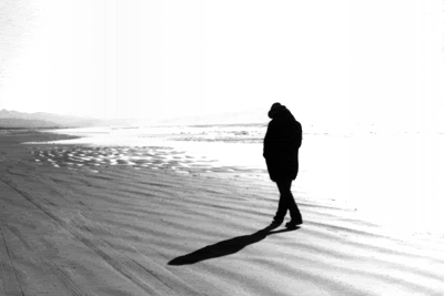
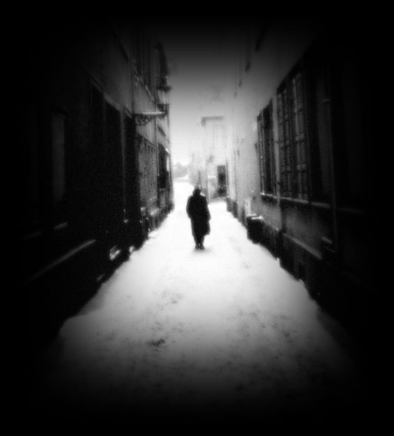
Hi guys! I'm looking for a sig, preferrably black and white; that expresses loneliness and depression. You know, like a guy standing somewhere, alone, with the special effects to really make it look depressing. These pics should give you an idea of what I'm talking about.
I love the second pic. Also please include my real name, Timothy; and the line "It's only me and I walk alone." (from Boulevard of Broken Dreams - Green Day)

-
10-26-2008 11:37 PM #5
still waiting for mine

-
10-28-2008 05:33 AM #6Veteran of the DV Wars


- Join Date
- Mar 2007
- LD Count
- ~35
- Gender
- Location
- Houston, TX
- Posts
- 4,553
- Likes
- 94
Awesome! Thanks a ton, ClouD! You're the man.

-
11-04-2008 10:56 PM #7Banned
- Join Date
- Sep 2008
- Gender
- Location
- White House (for now)
- Posts
- 5
- Likes
- 0
Does anyone feel up to the task?
Do Marlies sig first ^^


 Reply With Quote


 Posting Permissions
- You may not post new threads
- You may not post replies
- You may not post attachments
- You may not edit your posts
Bookmarks