


 LinkBack URL
 About LinkBacks


 Reply With Quote
I don't know much about photoshop but I think it's really cool, especially since it was all done with the mouse. I can't really comment, I don't understand photoshop but it looks great. |
|
Results 1 to 10 of 10
Thread: Drawn piece of artwork
-
05-03-2008 06:11 AM #1What?


- Join Date
- Jan 2008
- Gender

- Location
- Oregon
- Posts
- 372
- Likes
- 0
Mountain Seaside
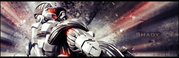
I drew this little picture before I got a tablet. It was all done with a mouse, hand-drawn in Photoshop. Coloring, shading, etc. was done with a mouse in Photoshop.

Comments, reviews, ratings?
By the way,
I don't like the name "Venomblood" either, but I made it for a video game when I was eight years old and thought it was "cool" so I'm kind of stuck with it.Last edited by Venomblood; 05-03-2008 at 05:09 PM.
-
05-03-2008 08:09 PM #2An itty-bitty fishy...

- Join Date
- Jan 2008
- Posts
- 143
- Likes
- 1
"Man is least himself when he speaks in his own person. Give a man a mask, and he will tell you the truth.
- Oscar Wilde
-
05-03-2008 09:10 PM #3
Why don't you post the larger image?
I can't really tell, but it looks like its just stuff that's been cut and pasted together and had a nasty lens flare added to the top of it.
-
05-03-2008 11:04 PM #4Dark Flapper

- Join Date
- Jan 2008
- Gender
- Location
- East London
- Posts
- 518
- Likes
- 2
How very cynical...
However, Aquanina may still be correct; a larger image would most certainly aid clarification.
If you created this without the use of gradient, blur or lighting tools then you are incredibly talented.
Even if not, it is an excellent signature and therefore well done!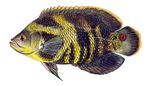 Beware of hitchhiking fish
-
05-03-2008 11:42 PM #5Not cynicism. Just expertise.
 Originally Posted by Barns


-
05-03-2008 11:43 PM #6What?
- Join Date
- Jan 2008
- Gender
- Location
- Oregon
- Posts
- 372
- Likes
- 0
That's the biggest it gets. That's how big I made it.
Aquanina: I agree on the lens flare. The reason it looks "cut and pasted together" is that a lot of things were drawn seperately then made to fit, such as the boat. But I can assure you, it was all drawn by me.
Barns: That's the biggest it gets. I didn't use gradients or lighting tools but I did do a slight amount of blurring. Thanks.
Well, it was made with a mouse. If I used my new tablet, it probably could have been bigger and finished sooner.
-
05-03-2008 11:50 PM #7
Hrm...
Enjoy your new tablet.
-
05-05-2008 02:17 PM #8Member

- Join Date
- Sep 2006
- Gender
- Location
- Portland, Oregon
- Posts
- 198
- Likes
- 4
While you may not have used any clip art to make this... I'm detecting quite a bit of filter here. Also a very strong adjustment using either Levels, Curves, or Brightness/Contrast to get the bright sun effect.
But it's impossible to tell exactly what when your image is only 150 by 250 pixels...
-
05-05-2008 03:50 PM #9Member

- Join Date
- Apr 2008
- Posts
- 168
- Likes
- 4
Not to shabby at all, couple things could be worked on though for future projects.
Defiantly make something bigger next time, can always resize it down later.. but when you make it small its very unclear, kinda hard to tell whats going on with the layers.
Don't mean to be an ass, but the balance in light is off, bit over contrasted on alot of it, and it just doesn't look blended properly >< Also the lens flare is way to apparent. Little things can really go a long way in an image..
I know you said you brushed all the lighting and shading by hand, but I gotta tell you I'm not seeing it. Im 100% sure theres one of the default lens flares thrown on top, and thats why you have this kind of inconsistent lighting on top of the image.. with no "real" depth. Sure you have a nice big light on the pic, but it just doesn't look like its in the right spots, and even if it is.. the image is to small to really tell. I spend more time working on lighting then anything else, and I still fail at it so dont feel bad.
I would defiantly say give it a try on a larger scale so you can work out the details a bit more, and also.. You dont need to be reluctant to tell us you used tools in photoshop, they are there for a reason Also try out the graphics tablet. When I work on texturing and sometimes modeling I cant get by without mine .
Its not bad dont get me wrong lol, just personally.. I find the blending to be iffy, which is obviously a must when you have multiple objects floating around without a really defined focal point. And also try to work on some better depth, Im just not feeling it ><.
If you are going to do it all by hand, then do it It takes alot of time and fine tuning to get a realistic effect, but it can defiantly work out. The worst thing you can do is throw a random filter on top and call it shading and light.
I hope none of that came out to rude or whatever lol... It just really feels like its missing a good chunk of flow.
-
05-09-2008 12:07 AM #10What?
- Join Date
- Jan 2008
- Gender
- Location
- Oregon
- Posts
- 372
- Likes
- 0

Here is a version without a lens flare. I didn't know using a default one looked that bad. Thanks for the advice though.
EDIT
Also, it's that big because I was using planning on using it as a signature at the time, plus it's hard to do detail with a mouse.


 Posting Permissions
- You may not post new threads
- You may not post replies
- You may not post attachments
- You may not edit your posts
Bookmarks