


 LinkBack URL
 About LinkBacks


 Reply With Quote
That spider looks pretty good. I like how the brush strokes look like fine hair. |
|
Results 1 to 24 of 24
 34Likes
-
 3
Post By naturespirit
3
Post By naturespirit
-
 2
Post By JadeGreen
2
Post By JadeGreen
-
 1
Post By <span class='glow_FF1493'>DawnEye11</span>
1
Post By <span class='glow_FF1493'>DawnEye11</span>
-
1
Post By naturespirit
-
1
Post By <span class='glow_FF1493'>DawnEye11</span>
-
1
Post By naturespirit
-
 2
Post By Tataglia
2
Post By Tataglia
-
 2
Post By Sensei
2
Post By Sensei
-
1
Post By Tataglia
-
1
Post By JadeGreen
-
1
Post By <span class='glow_FF1493'>DawnEye11</span>
-
1
Post By naturespirit
-
2
Post By naturespirit
-
1
Post By JadeGreen
-
4
Post By naturespirit
-
1
Post By JadeGreen
-
2
Post By naturespirit
-
1
Post By JadeGreen
-
1
Post By naturespirit
-
1
Post By JadeGreen
-
1
Post By naturespirit
-
1
Post By JadeGreen
-
2
Post By Tataglia
Thread: Naturespirit`s non-dream related artwork
-
01-04-2017 10:30 PM #1Intrepid Explorer Achievements:


- Join Date
- Oct 2016
- LD Count
- ~312
- Gender

- Posts
- 255
- Likes
- 284
- DJ Entries
- 88
Naturespirit`s non-dream related artwork
Over the last three days I have been really practising with the wacom, and have formed a routine of doing a 'warmup' before a proper painting.
Here's what my routine would look like:

Then


Then

I think I over-highlighted the second warmup.
But, overall I am happy with my achievements. Deep in the human unconscious is a pervasive need for a logical universe that makes sense. But the real universe is always one step beyond logic.
-
01-06-2017 07:31 PM #2Hetrochromic Oneironaut Achievements:


- Join Date
- Mar 2012
- LD Count
- Not a contest
- Gender
- Location
- Here and Now
- Posts
- 963
- Likes
- 2643
- DJ Entries
- 720
naturespirit and DawnEye11 like this.
-
01-06-2017 08:27 PM #3Long Time Lucid Explorer Achievements:
- Join Date
- Jan 2014
- Gender

- Location
- On A Special Star
- Posts
- 1,267
- Likes
- 3603
- DJ Entries
- 456
They look cute. : ) Something that would help is practicing drawing objects in real life. You can start by sketching a line that shows the axis of your object. Than sketching out simple shapes you think make the object. An example would be how an apple can have a circle shape and a pear can have a circle and cone shape to it. Don't forget to think of your object as 3d and having volume when you sketch.Than you keep on sketching it until you feel that you have gotten to know your object enough to outline it with a darker line.This is the best I could explain it in text. ^^" Sorry if it sounds confusing
Last edited by DawnEye11; 01-06-2017 at 08:30 PM.
naturespirit likes this. "Be the best You, you can be...Relax...Listen...Imagine...*Silence*...Zzzzz"
DreamCafe11----DawnEye11
DreamBuddy-Jadegreen
-
01-06-2017 10:13 PM #4Intrepid Explorer Achievements:
- Join Date
- Oct 2016
- LD Count
- ~312
- Gender
- Posts
- 255
- Likes
- 284
- DJ Entries
- 88
Thanks JadeGreen, I think that is an excellent idea to bring out more visual interest by variations in color! Originally Posted by JadeGreen

I shall start doing that, and I think it should greatly help!They look cute. : ) Something that would help is practicing drawing objects in real life. You can start by sketching a line that shows the axis of your object. Than sketching out simple shapes you think make the object. An example would be how an apple can have a circle shape and a pear can have a circle and cone shape to it. Don't forget to think of your object as 3d and having volume when you sketch.Than you keep on sketching it until you feel that you have gotten to know your object enough to outline it with a darker line.This is the best I could explain it in text. ^^" Sorry if it sounds confusingDeep in the human unconscious is a pervasive need for a logical universe that makes sense. But the real universe is always one step beyond logic.
-
01-06-2017 10:14 PM #5Intrepid Explorer Achievements:
- Join Date
- Oct 2016
- LD Count
- ~312
- Gender
- Posts
- 255
- Likes
- 284
- DJ Entries
- 88
Thanks JadeGreen, I think that is an excellent idea to bring out more visual interest by variations in color! Originally Posted by JadeGreen
I shall start doing that, and I think it should greatly help!They look cute. : ) Something that would help is practicing drawing objects in real life. You can start by sketching a line that shows the axis of your object. Than sketching out simple shapes you think make the object. An example would be how an apple can have a circle shape and a pear can have a circle and cone shape to it. Don't forget to think of your object as 3d and having volume when you sketch.Than you keep on sketching it until you feel that you have gotten to know your object enough to outline it with a darker line.This is the best I could explain it in text. ^^" Sorry if it sounds confusing
PS: Freakily, I dreamt last night that you would both reply. DawnEye11 likes this.Deep in the human unconscious is a pervasive need for a logical universe that makes sense. But the real universe is always one step beyond logic.
-
01-06-2017 10:37 PM #6Long Time Lucid Explorer Achievements:
- Join Date
- Jan 2014
- Gender
- Location
- On A Special Star
- Posts
- 1,267
- Likes
- 3603
- DJ Entries
- 456
Your welcome. Glad it will help.^w^ Also,you double posted. XD Hehe That is a funny coincidence. Owo Maybe you saw the future or... it could be cause were active on the art section of this forum.
naturespirit likes this."Be the best You, you can be...Relax...Listen...Imagine...*Silence*...Zzzzz"
DreamCafe11----DawnEye11
DreamBuddy-Jadegreen
-
01-08-2017 10:35 PM #7Intrepid Explorer Achievements:
- Join Date
- Oct 2016
- LD Count
- ~312
- Gender
- Posts
- 255
- Likes
- 284
- DJ Entries
- 88


Did these just then. Not feeling that well. DawnEye11 likes this.Deep in the human unconscious is a pervasive need for a logical universe that makes sense. But the real universe is always one step beyond logic.
-
01-09-2017 12:44 AM #8
I'm sorry to hear, get well soon
I like your enthousiasm, you seem to draw very loosely. But I fear that with this method, you'll stagnate your skills and get frustrated later.
Painting and drawing takes time, 4-5 hours or 1 hour for a simple study are not unheard-of. Enjoy the time.
You draw in symbols, they are by definition flat. A symbol is just a recognisable shape of an object.
You need to draw and think in form instead of lines, understand light, colour, etc.
Use References! If you want to draw a candy stick, gather photo's, real-life objects.
Ask yourself questions. In what pattern does the red line wind-up around the candy stick?
What's the value and chroma of the red colour? How do I render it glossy? How would the colour shift in a moon-lit environment? etc
If you know the object, only then can you play around with it and re-invent it to your dreams image of that object.
On brush technique, in theory you only need a hard and soft brush, pay attention to those hard and soft edges.
A rendering process could look something like this: Paint -> Erase -> Paint -> Erase -> etc.
With the help of Layers and masks, we get more control. Paint on top of another layer and have those images seperated.
If Photoshop or other painting programs with layer functionality aren't an option, use Krita it's free and good.
Best advice I can give is always draw a lot, and draw from life.
Best of Lucknaturespirit and JadeGreen like this.
-
01-09-2017 12:38 PM #9

MemberAchievements:


- Join Date
- Sep 2012
- Gender
- Location
- The Depths
- Posts
- 4,418
- Likes
- 5601
- DJ Entries
- 116
tataglia
I just read and did the exercises from "drawing on the right side of the brain." and my drawing went from symbols to lines, relationships, lights, etc. I havent practiced it much, but my drawing still looks a thousand times better than it did. I am obviously still a beginner, but i am beginning to see and understand art better. I am working on animals and landscape and hope to make my dream worlds and creatures come to waking soon.
-
01-09-2017 02:10 PM #10
Sensei, it's nice to hear that.
I'm not familiar with those exercises.
Be sure to not let them become a chore, they need to remain fun to get the most benefit out of them.
Challenge yourself and fail a lot All this knowledge to learn art is readily available but there are no shortcuts.
Sensei likes this.
All this knowledge to learn art is readily available but there are no shortcuts.
Sensei likes this.
-
01-09-2017 03:20 PM #11Hetrochromic Oneironaut Achievements:
- Join Date
- Mar 2012
- LD Count
- Not a contest
- Gender
- Location
- Here and Now
- Posts
- 963
- Likes
- 2643
- DJ Entries
- 720
Man, I wish I got this kind of constructive critique on MY work. You're lucky, naturespirit.I'm sorry to hear, get well soon
I like your enthousiasm, you seem to draw very loosely. But I fear that with this method, you'll stagnate your skills and get frustrated later.
Painting and drawing takes time, 4-5 hours or 1 hour for a simple study are not unheard-of. Enjoy the time.
You draw in symbols, they are by definition flat. A symbol is just a recognisable shape of an object.
You need to draw and think in form instead of lines, understand light, colour, etc.
Use References! If you want to draw a candy stick, gather photo's, real-life objects.
Ask yourself questions. In what pattern does the red line wind-up around the candy stick?
What's the value and chroma of the red colour? How do I render it glossy? How would the colour shift in a moon-lit environment? etc
If you know the object, only then can you play around with it and re-invent it to your dreams image of that object.
On brush technique, in theory you only need a hard and soft brush, pay attention to those hard and soft edges.
A rendering process could look something like this: Paint -> Erase -> Paint -> Erase -> etc.
With the help of Layers and masks, we get more control. Paint on top of another layer and have those images seperated.
If Photoshop or other painting programs with layer functionality aren't an option, use Krita it's free and good.
Best advice I can give is always draw a lot, and draw from life.
Best of Luck
This is all very good advice. I suggest you look into these things; I don't really have much to add here. This is a pretty exhaustive review of what I think is working in your art and what could be improved.naturespirit likes this.
-
01-09-2017 06:46 PM #12Long Time Lucid Explorer Achievements:
- Join Date
- Jan 2014
- Gender
- Location
- On A Special Star
- Posts
- 1,267
- Likes
- 3603
- DJ Entries
- 456
I think I'd like to add that there's nothing wrong with starting out with shapes or symbols in order to get to know your object. Also, there are more techniques to learn when it comes to art but I think Naturespirit would benefit more If he focuses on one thing at a time before he can do the rest. Perhaps drawing the objects would make it easier to paint them? You don't even have to try shading yet. Just focus on drawing the objects until you feel ready to move on to the next step.Ofcourse having a teacher by your side would help greatly when your drawing but looking up tutorials might help you get into the drawing thinking process.
Last edited by DawnEye11; 01-09-2017 at 06:52 PM.
naturespirit likes this."Be the best You, you can be...Relax...Listen...Imagine...*Silence*...Zzzzz"
DreamCafe11----DawnEye11
DreamBuddy-Jadegreen
-
01-09-2017 10:18 PM #13Intrepid Explorer Achievements:
- Join Date
- Oct 2016
- LD Count
- ~312
- Gender
- Posts
- 255
- Likes
- 284
- DJ Entries
- 88
Thanks for all the replies! Sorry there isn't enough room to quote you!
I'll look out the this book 'Drawing on the Right Side of the Brain'
Sounds like something I'd be interested in.
I shall do some more off-screen sketching (help my lucids getting off the screen!).
For info, I am using 'Corel Draw Essentials 5'; it came with my tablet.DawnEye11 likes this.Deep in the human unconscious is a pervasive need for a logical universe that makes sense. But the real universe is always one step beyond logic.
-
01-22-2017 07:13 AM #14Intrepid Explorer Achievements:
- Join Date
- Oct 2016
- LD Count
- ~312
- Gender
- Posts
- 255
- Likes
- 284
- DJ Entries
- 88


Been doing my sketches as well, but I can't put them through the scanner because they are in a sketchbook.
Feedback appreciated!
PS: I bought the right side of the brain book
Deep in the human unconscious is a pervasive need for a logical universe that makes sense. But the real universe is always one step beyond logic.
-
01-23-2017 12:45 AM #15Hetrochromic Oneironaut Achievements:
- Join Date
- Mar 2012
- LD Count
- Not a contest
- Gender
- Location
- Here and Now
- Posts
- 963
- Likes
- 2643
- DJ Entries
- 720
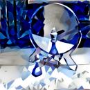
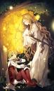
I like the rose you've done in the first picture. It's the first time one of your works has shown a level of dimensionality and coming off the page. If you want to get your work into a somewhat more 3D and less iconographic look, at least with the top part and the petals. How you've used color to create shape here is working fairly well. (If I recall correctly using color to create depth was my criticism of your first batch of works, so It thrills me to see you are now studying that.) I think the bottom part could use some work though, it lacks that distinctive bell shape that roses have, and makes it look more like a poppy. The stem could use some more definition and effort put into it aswell.
I don't think the second composition is as strong. The flower petals seem somewhat straight in where I feel they should bend and curve outward to imply the opening and the presence of the flower in three dimensional space and make the subject more recognizable. That and their placement against the black background makes me want to read them as white and pink supernova explosions in outer space rather than flowers. Also there is a strange glowy blurring effect on the right hand side of the flower in the upper right hand corner of the second piece that isn't repeated elsewhere in the composition. It looks like you might have been trying to smudge out a mistake there.naturespirit likes this.
-
01-23-2017 03:09 AM #16Intrepid Explorer Achievements:
- Join Date
- Oct 2016
- LD Count
- ~312
- Gender
- Posts
- 255
- Likes
- 284
- DJ Entries
- 88

Just saw your post JadeGreen, I'll see what I can do!
Deep in the human unconscious is a pervasive need for a logical universe that makes sense. But the real universe is always one step beyond logic.
-
01-23-2017 05:09 AM #17Hetrochromic Oneironaut Achievements:
- Join Date
- Mar 2012
- LD Count
- Not a contest
- Gender
- Location
- Here and Now
- Posts
- 963
- Likes
- 2643
- DJ Entries
- 720
omg look at you go! This is really a step up from your previous works.
 But you seem to be thriving on our collective constructive criticism so I see no reason not to keep a good thing going.
You seem to have a good grasp of atmospheric perspective in this composition, using brighter colors to bring out whats closer to the eye than the background. (Something that my work generally lacks in, my work often looks rather flat and I would like to look into improving that.) Thought he plat does seem to be lacking some structure, its a much more convincing illusion than your previous works.
The rose at the center is much improved and is a much more recognizable shape, and has a good range of colors within it. I really get the feel that it's the focus of the painting and can see that care went into rendering it. (Though the blobby stroke to the right of the center of it that is a more vivid pink than the rest is a tad distracting.)
One thing I would look into is how you could use your brush strokes more intelligently to imply shapes and volumes. In some places you're coming close to doing this, (I would like to make special note of the top of the pink rose in the middle, the colors look really well blended there and the strokes follow the shape.) but in others (I'm looking at the leaf on the left) they come off as a bit mindless. Using the example of a leaf you might consider starting every stroke at the base where the stem meets the leaf and fanning off the sides of the stem, starting every stroke at the stem until you've built up the shape that you've want. Or in the case of a rose or round object, having brush strokes that wrap around it or follow the contours to imply the shape. Good use of of color and brush stroke are going to sell these paintings.
Also be more mindful of your backgrounds. In the red rose picture, It looks as though you were using a semi-transparent layer to paint the darker parts of the rose, muddying the red a bit and making it darker through the green background, and it was really successful. Here, in the 'top' of the pink rose there are areas where the dark brown background shows through and it isn't as successful. There would be a value contrast there but there would probably not be any dark brown showing in it.
Your flat backgrounds in general could probably be changed, at least when you want to get to finished works. Even if you don't want to do a fully detailed background, something basic, with some texture and brush strokes in some subdued colors filling the whole page would instantly bump your paintings up a bit. But if for now you're just interested in developing the foreground objects, then don't worry too much about it. But I have my own bias since most of my work tends to be character drawings that have very little thought put into the background, mostly on the grounds of "they're just practice for that comic strip I'm never going to released". Really I think flat backgrounds can work so long as they add to the subject, rather than conflict with it.
And that is where my criticism reaches its limit. I have my own biases in how I perceive art should be done. Granted I recognize you are interested in developing a painting style and that is vastly different from my more graphical style, and a recognize you are interested in different subject matter, my aspirations for what your art can become probably differ from your own. So I suggest you don't take criticism blindly, and don't take it only from me. Listen to what the other posters have to say, think about everything everyone says about your art, consider their viewpoint and form your own view on how your art needs to change from that. I'll gladly continue to come to see what new works you come up with, and give you my feedback, but remember that I'm not your only critic.naturespirit likes this.
-
01-24-2017 09:40 PM #18Intrepid Explorer Achievements:
- Join Date
- Oct 2016
- LD Count
- ~312
- Gender
- Posts
- 255
- Likes
- 284
- DJ Entries
- 88
Relatively easy bird paintings.

 lunagoddess and JadeGreen like this.Deep in the human unconscious is a pervasive need for a logical universe that makes sense. But the real universe is always one step beyond logic.
-
01-25-2017 01:59 PM #19Hetrochromic Oneironaut Achievements:
- Join Date
- Mar 2012
- LD Count
- Not a contest
- Gender
- Location
- Here and Now
- Posts
- 963
- Likes
- 2643
- DJ Entries
- 720
Once again, I think that your first composition as a whole is much more successful. The bird's body has more shape to it than the second, and there are more subtle variations and layerings in the blues. I also like that in places your strokes are following the shape of the bird's body. I feel like the anatomy of the feet and tail might be a bit watered down, though after a quick google search of Birds on Pearches and examining pictures at a similar angle, you might not be as off as I originally thought. It also looks like you were challenged in rendering the pattern on the bird's wing. I can tell you made an effort, but it's not as successful as it could be.
The second one needs some improvement. The first thing that comes to my mind is the shapes in the bird's body and on the beak are not very defined. It just sort of looks like the whole bird is oval shaped and theres not a lot of differentiating between the body and the head. (This could also be worked on with colors and shading, or brush strokes, those can be used to better define shape.). Sometimes this is just a matter of a challenging pose. Looking online for similar images of real life birds in this position, its easy to see how it could have been simplified unintentionally, even with a reference.naturespirit likes this.
-
01-26-2017 04:16 AM #20Intrepid Explorer Achievements:
- Join Date
- Oct 2016
- LD Count
- ~312
- Gender
- Posts
- 255
- Likes
- 284
- DJ Entries
- 88
Thanks!
I decided to give it a few bird seeds!
 JadeGreen likes this.Deep in the human unconscious is a pervasive need for a logical universe that makes sense. But the real universe is always one step beyond logic.
-
01-27-2017 01:09 AM #21Hetrochromic Oneironaut Achievements:
- Join Date
- Mar 2012
- LD Count
- Not a contest
- Gender
- Location
- Here and Now
- Posts
- 963
- Likes
- 2643
- DJ Entries
- 720
Its a modest improvement, the beak has a bit more volume and definition than before, though the shape still looks a bit awkward it does look like you've made an effort to improve it. I can see you've worked the body a little bit in an effort to clean it up and bring out more volume, though to be frank, it's not as effective as it could be.
Remember that all objects and living things are made up of basic shapes, sometimes put together in very complex ways. If you know what these shapes are and how they are present in space you can use that information to bring out that dimensionality. If you're interested in painting birds or wildlife in general, I would attempt painting some basic objects (cups, boxes, and things like that.) and practice creating values and volume with them before moving to more complex things.
Also, out of curiosity, were you using any references for these bird paintings? If so, would you be willing to post them so that I could see how you're translating from the references to the final painting?naturespirit likes this.
-
01-27-2017 01:15 AM #22Intrepid Explorer Achievements:
- Join Date
- Oct 2016
- LD Count
- ~312
- Gender
- Posts
- 255
- Likes
- 284
- DJ Entries
- 88
I have been doing basic objects in my sketches, but I'll start doing it on the computer as well Originally Posted by JadeGreen
I used this picture a little for the robin: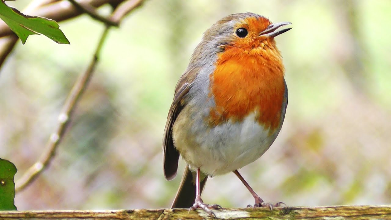 JadeGreen likes this.Deep in the human unconscious is a pervasive need for a logical universe that makes sense. But the real universe is always one step beyond logic.
-
01-27-2017 02:20 AM #23Hetrochromic Oneironaut Achievements:
- Join Date
- Mar 2012
- LD Count
- Not a contest
- Gender
- Location
- Here and Now
- Posts
- 963
- Likes
- 2643
- DJ Entries
- 720
Hmm it actually looks like you're following the reference pretty closely. Looking closely at your painting I see the value differences that youve observed in the reference, you're under-representing them in your painting, and more focused on the colors of the birds feathers. You need to take both of these into account.
In your first painting, the one with the blue bird, there doesn't seem to be too much value variation, but interest and complexity doesn't come from the value and three dimensionality so much as the interesting shapes. (Though the dimensionality is improved with use of the interesting shapes.) Recognize that there are multiple ways to add interest to a piece. You might choose to focus on color, shape, pattern, lighting, etc. Obviously using these in conjunction with one another, your work can get really interesting. In the case of the robin, the shape isn't that interesting, the bird is just kind of oval shaped, so I started looking for value to bring it out and that wasn't really present either, and that's where my criticism is coming from.
You know I feel kind of bad. I feel like I'm prowling this thread and viciously deconstructing your artwork every time you post something. I know I've kept my criticism constructive and offered alternatives for how you can improve your work but if you ever want me to take a break so you can just focus on what you want to do let me know.
*Sighs* I'm too nice to be an art critic.  naturespirit likes this.
-
01-29-2017 02:05 PM #24
Let me first say, I agree with JadeGreen, there's progress.
In particular, the pink rose is phenominal. For some reason that painting pops out above all others, with minimal brush strokes it's still very believable. The other ones, a bit less well executed. The pink rose is my favourite so far. Keep it going
The blue bird painting strokes remind me a bit of drawing on a whiteboard with a whiteboard marker that's nearly depleted. It smudges the color strokes around. Other painting brushes can help. The basic ones are a hard round and soft round brush. In combination with erasing soft or hard.
Pressure sensitivy helps ass well (thickness (thick or thin lines), flow (pigment flow))
I think that the main culprit is in your technique. You're using corel draw essentials. I'm not familiar with that.
I've looked at the website of drawing with the right side of your brain, the book suggested by Sensei. The before and after pictures of students are very promising, though.
Ok Anyway. I saw your little robin, I though it's nice, it had some character, I'm pleased to see you seem to use layers, and erasing some paint.
When I saw the reference, I had a desire to paint it ass well. It's a challenge.
Then I thought why not document the progress, I hope you don't mind, it's your thread.
It's hard to explain something in art, and not be able to show it. This is probably the first and last time I do it this way.
I think it's best to start with basic brushes. Jadegreen said to start by practising basic shapes, values and creating volume.
I couldn't agree more. It's always beneficial to practise that, and it's never easy. I also did some colour transitions using a softbrush and hard eraser.
You could start with a sketch, a line painting, a more sculpting approach, all-in-one-layer etc.
This approach, is more of making a shape, masking layer, and painting inside the object.
There are 3 things to take into account when choosing colours.
Values (How light or dark)
Chroma (How much colour pigment, from grey to an intense red for instance)
Hue (The colour itself, warm colours (red, orange yellow), cold colours (blue, green, purple)
For the background you picked a very intense standaard green, I disagree, if you look closely it's lighter, the hue shift is a little closer to yellow then to blue, and it's a less intense green. If you keep working from the start with this intense green, you get confused. Take your time to pick the right colours. Going back and forth in the process is very normal.
Since this is a photo reference, there's a lot of blur to keep the bird in focus. The background also has a lot of small hue and value variations, I see pinks, green, yellows blue-green's, dark-reds, etc. The tree trunk, I made with just the soft brush and eraser. The other objects are just shapes with a masking layer on top. So I keep painting in the boundaries of that object. To finish it, I paint some more details on top of it. Like the feathers and the legs. When doing more shadows or lighter area's I shift the hue ass well. More to warmer colours when it's darker. There are so many hue differences in this little bird. It's definitely not a simple orange, white, brown bird.
The goal is never to replicate exactly what you see, but capturing it's likeness is more important. You'll see all kinds of fascinating things, when studying this. I'm very certain this took me a lot more time than you did. When doing complex studies, you really need to have patience and take things slowly.
 JadeGreen and naturespirit like this.

Similar Threads
-
Naturespirit's 'Depths of the Subconscious'
By naturespirit in forum Artists' CornerReplies: 5Last Post: 01-02-2017, 06:15 AM -
Lucid dream artwork (game cover style)
By ruba in forum Artists' CornerReplies: 0Last Post: 11-29-2010, 10:30 PM -
Lady Grimbone's Artwork and dream sketches
By Lady Grimbones in forum Artists' CornerReplies: 3Last Post: 05-20-2009, 01:20 PM -
phallam's Artwork Corner *DREAM SKETCH ADDED@
By WaveShaper in forum Artists' CornerReplies: 16Last Post: 08-30-2004, 01:10 AM
Tags for this Thread
 Posting Permissions
- You may not post new threads
- You may not post replies
- You may not post attachments
- You may not edit your posts
Bookmarks